InspireVault
A visual library for design references. Save a URL, let the product sort it, then search a gallery when you need it again.
Challenge
Saving inspiration is easy. Finding the right reference later is the difficult part.
Reference gets saved constantly — a tab, a bookmark, a screenshot, a link sent to yourself — and almost none of it is ever found again. Browser bookmarks store a title and a URL, which is the wrong index for something remembered visually: you recall a layout, a colour, a type treatment, not the name of the site.
Filing is where it collapses. Tagging every save by hand is work done now for a benefit that may never arrive, so it does not get done, and the library decays into a list of links whose contents you can no longer picture.
InspireVault treats the library as something to be looked at rather than read.
- Falls shortBrowser bookmarksThey store a title and a URL, while people often remember a layout, a colour, or a type treatment.
- Falls shortA screenshots folderKeeps the picture and loses the source, so the thing you wanted to look at again cannot be visited.
- Falls shortManual tagging in a notes appWork done now for a benefit that may never arrive. It stops being done, and the library rots.
Research & framing
Structure, flows & trade-offs
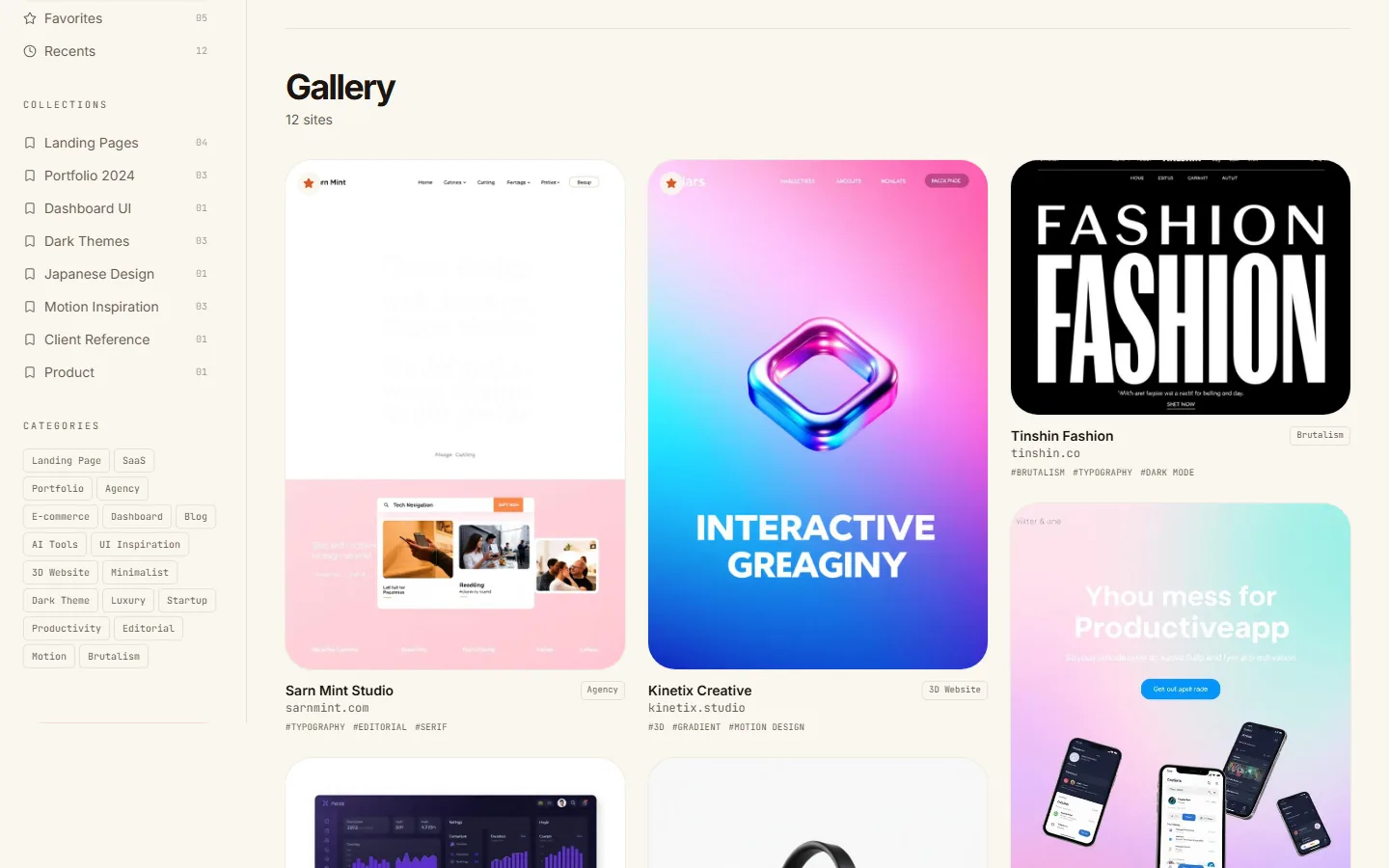
Collections down the side, a gallery in the middle, search across everything.
The interface is a library, not a feed. A sidebar carries the core views — Everything, Favorites, Recents — each with a live count, with collections and categories beneath, so the same saved item can be reached by whichever route the person happens to remember.
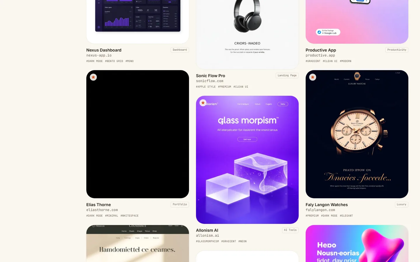
The centre is a thumbnail gallery. Cards show the site as it looks, with its source and tags attached, which lets recognition do the work that recall would otherwise have to do.
Saving is one action in the header: add a URL, and the tagging and categorising happen without anyone doing the filing. Search sits beside it and runs over the whole vault, including a field for describing what you are looking for rather than naming it.
- ChosenThumbnail as the primary objectThe card is the page as it looks. Recognition does the work that recall would otherwise have to do.
- ChosenTagging and categorising happen automaticallyThe cost of saving is one paste, which is the only price at which a reference library keeps growing.
- ChosenOne screen, no detail viewNothing to enter and back out of. What is being looked for is a look, and a look is recognised at thumbnail size or not at all.
Solution
The details that decide whether a reference library survives its first hundred entries.
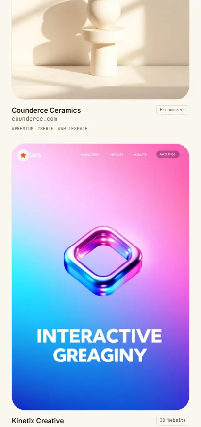
Thumbnails as the primary object. Every card is the page as it appears, sized to be scanned in a grid, because visual memory is the index the whole library is built around.
Automatic tagging and categorisation. The cost of saving is one paste, so the library keeps growing instead of stalling at the point where filing becomes a chore.
Counted views. Everything, Favorites and Recents carry their counts in the sidebar, so the size and shape of the collection is visible without opening anything.
Taste read back to you. The vault notices the shape of what has been collected — a lean toward minimalist Swiss layouts, say — and suggests adjacent tags such as Brutalism or Editorial, which turns a passive archive into something that widens what you look at.
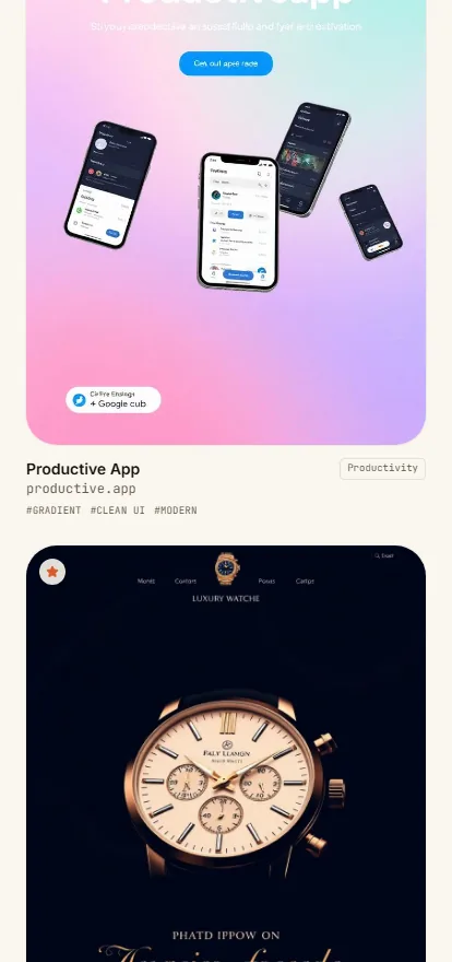
Everything is one screen deep. The sidebar carries the counts, the grid carries the thumbnails, and the search field sits above both. The gallery is designed for quick visual scanning, so there is no detail view to enter and back out of.
Validation & iteration
- 01
- 02
- 03
Outcome
- Live at inspirevault.netlify.appchecked 1 September 2026
- The full library, including collections, categories, counted views and search, with no account requiredchecked 1 September 2026
- Desktop and phone layouts both shippedboth captured for this case study
The whole product is reachable and populated: a working library of saved references with collections, categories, counts and search, which is more than most tools of this kind show before signup.
Reflection & limits
It is one screen, and that is both the design and the ceiling. The library reads well at a dozen entries; the interesting questions all start at a thousand, where sorting, deduplication and stale-link handling stop being optional and the automatic tagging has to be right rather than merely present.
Nothing on the current surface says what happens then.