Kartanesia Studio
A studio that turns weddings, birthdays, and anniversaries into small interactive experiences people can play through and share.
Challenge
A digital invitation is opened once, skimmed, and never returned to.
The category it competes in is the templated e-invitation: a page with the couple’s names swapped in, a countdown, a map and an RSVP form. It works, and it is completely forgettable, because there is nothing in it that belongs to the people it is about.
That is a real loss for the sender. The moment being marked is the most personal thing in their year, and the artefact representing it is indistinguishable from the one a colleague sent last month.
Kartanesia is built on a different premise: that the thing should be an experience the recipient moves through, made out of details only the two of them would recognise, and ending on something worth sending on.
- Falls shortA templated e-invitationNames swapped in, a countdown, a map. It is opened once, skimmed, and closed. Very little of it feels specific to the people being celebrated.
- Falls shortA printed cardPersonal and finite. It cannot hold a song, a video, or the thing that only makes sense if you were there.
- Falls shortA photo carousel on social mediaReaches everyone and is addressed to no one. There is no sense of having been given something.
Bukan soal acaranya, tapi soal rasanya. Setiap momen punya cara cerita sendiri.
Research & framing
Structure, flows & trade-offs
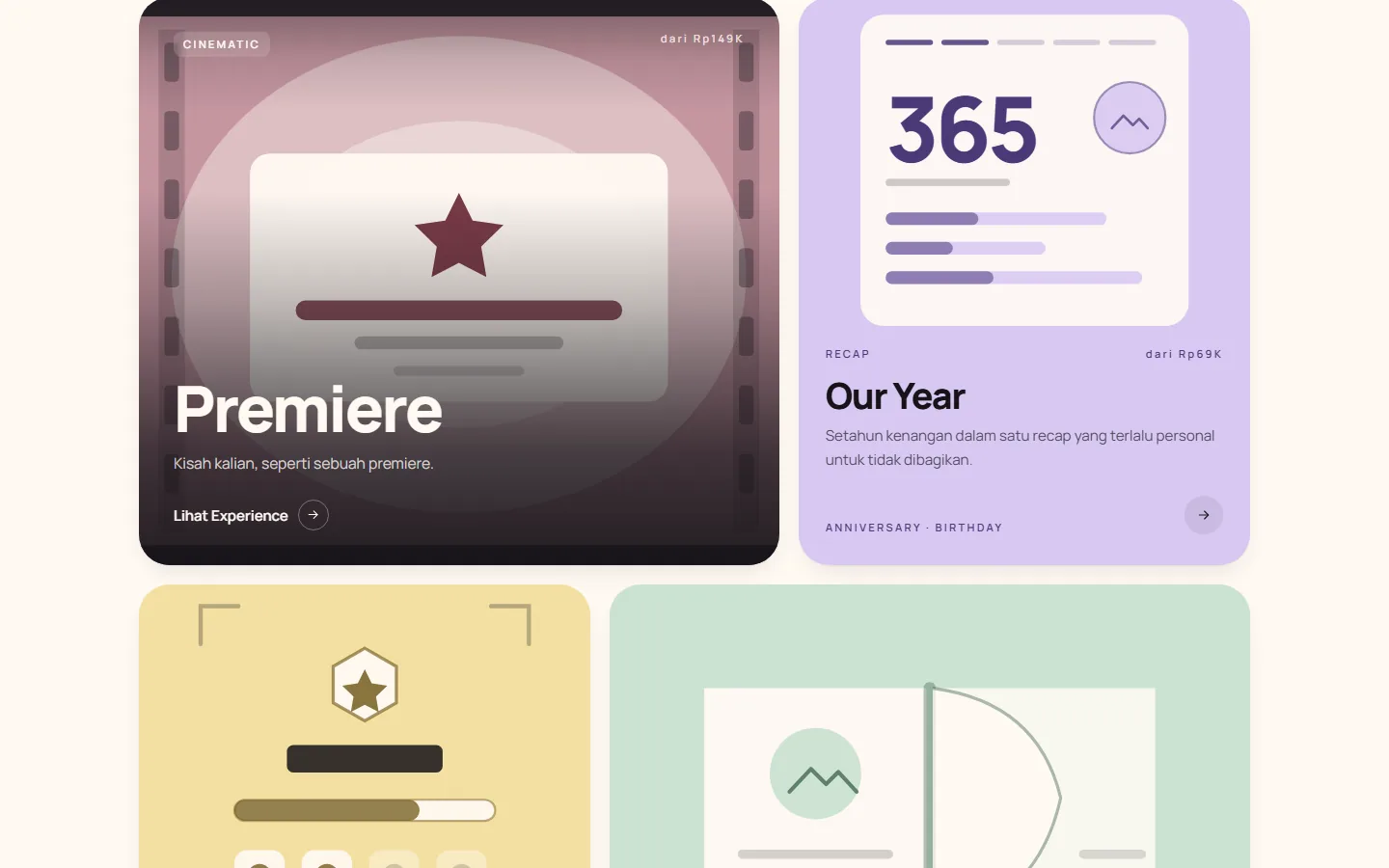
Six worlds, each built around a different feeling.
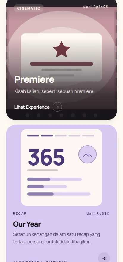
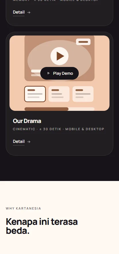
The catalogue is not organised by event type, which is how the rest of the category organises it. It is six named worlds — Premiere, Our Year, Achievement, Storybook, Museum, Our Drama — each with its own format, its own visual language and its own way of telling a story.
Each card still names the occasions it suits, so the practical route stays intact: someone who arrives thinking "wedding" is not lost. But the first question the page asks is which one feels like you, and the copy says so outright — the difference is not the event, it is how it feels.
Ordering is four steps, published on the page: choose the world, tell them the moment, they build it, you get one link. The last step is doing quiet work — no install, no account, nothing for the recipient to do but open it.
- ChosenOrganise by world, not by occasionSix formats with their own voice. The category sorts by event, so many options look the same; the occasion is still on every card for anyone who wants it.
- ChosenPlayable demos on the marketing pageVisitors can judge the promise of something "worth opening twice" by playing each world for themselves.
- ChosenOne link, no install, no accountGuests receive a link they can open immediately. Keeping the experience simple gives them fewer reasons to leave.
The site runs in Indonesian and English as sibling routes rather than as a toggle bolted onto one language, which for a product about wording — inside jokes, nicknames, the way two people actually talk — is the difference between translated and written.
Underneath the six worlds sit occasion routes for weddings, birthdays and love stories. Someone who came looking for a wedding invitation gets a page about weddings; someone browsing gets the worlds. Two entrances to the same catalogue, neither of them a compromise.
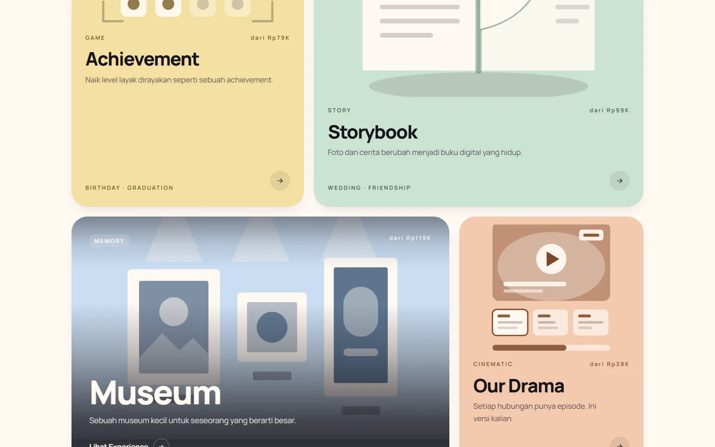
Pricing is on the card, not behind an enquiry. Each world carries its starting price, and the packages state the working days, the number of revisions included and how long the link stays live. These are the details a buyer of a made-to-order digital product actually worries about.
Solution
The best way to understand each world is to try it.
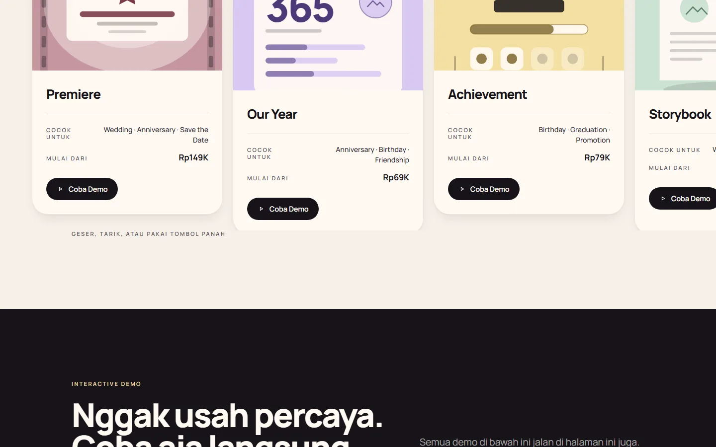
All six worlds are playable on the marketing page itself. Not a video of a demo, and not a mockup that only looks good in a screenshot — the page says as much in those words — each labelled with its format, a run time of about thirty seconds, and the fact that it works on phone and desktop alike.
That is the whole sales argument for a product nobody has heard of, in a category where everything looks the same in a thumbnail. "Worth opening twice" cannot be described; it has to be handed over.
The four positions the studio takes are stated next to the demos: not templates, made to be played, personal from the start, worth re-sharing. Every one of them is a claim the demos immediately have to carry, which is a deliberately exposed place to stand.
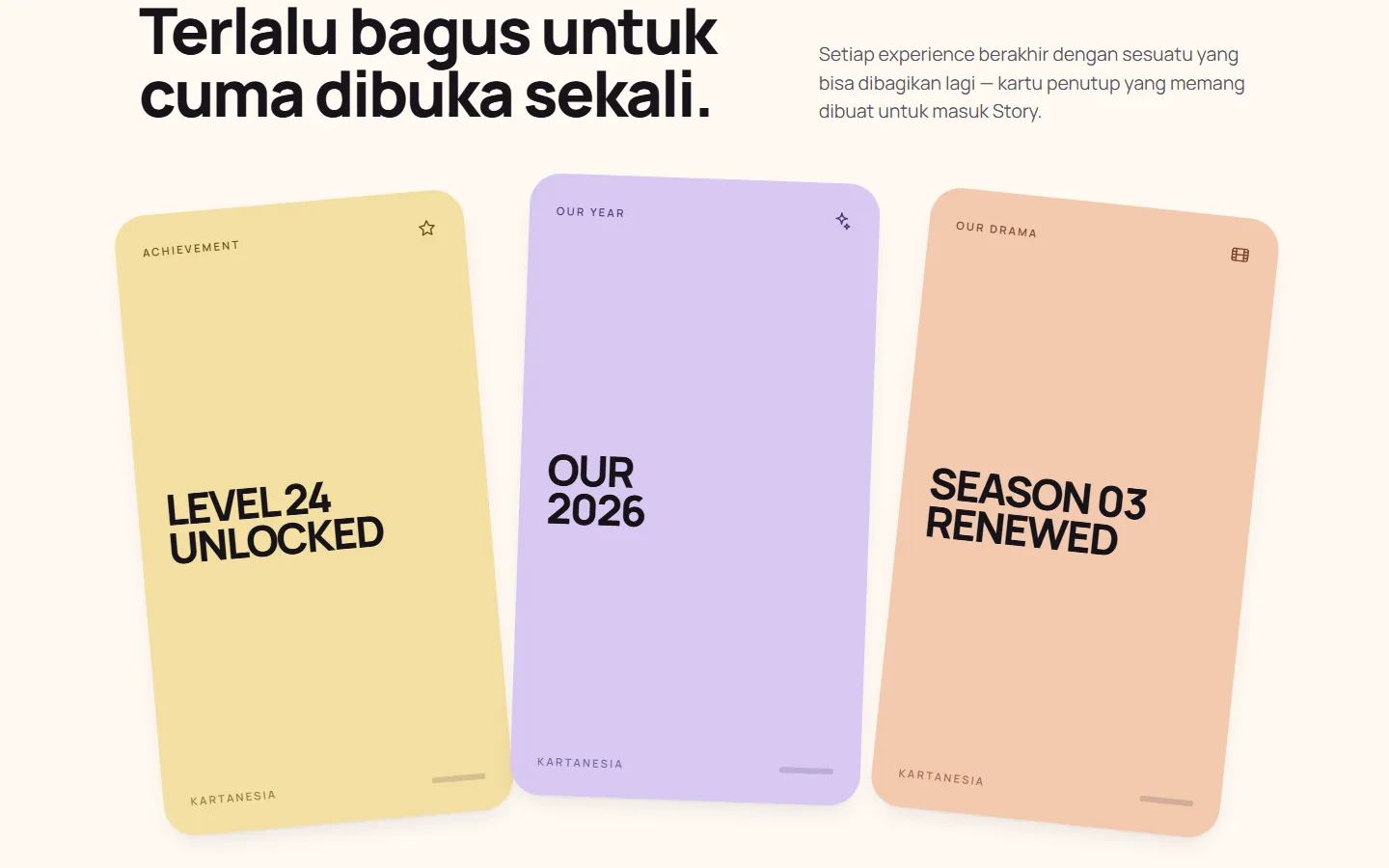
Every experience is built to end on something shareable. The closing cards — "Level 24 Unlocked", "Our 2026", "Season 03 Renewed" — are designed as the artefact that gets posted to a Story afterwards, under a heading that states the reasoning: too good to be opened only once.
For a product whose entire distribution is people sending it to each other, designing the last screen as the thing worth sending on is not a flourish. It is the growth model.
The studio is new and says so. Where a competitor would put a row of five-star reviews, this page states that Kartanesia has only just opened, that invented testimonials will not be posted here, and that the first customer stories will appear as they are — including the ones who asked for three rounds of revisions.
Choosing to have visibly nothing there, rather than something fabricated, is a harder decision than it looks on a page whose job is to convert.
Validation & iteration
- 01
- 02
- 03
Outcome
- Live at kartanesiastudio.vercel.appchecked 1 September 2026
- Six worlds with playable demos, occasion pages for weddings, birthdays and love stories, plus studio, FAQ and contact, in Indonesian and Englishchecked 1 September 2026
- Desktop and phone layouts both shippedboth captured for this case study
What shipped is a studio with a catalogue, six working demos anyone can play without asking for anything, published pricing with revision counts and link lifetimes, and a bilingual site built as two real language routes rather than a toggle.
It is new, and this page does not pretend otherwise. There are no client outcomes to report yet, and the studio’s own site says the same thing in the place where reviews would normally go.
Reflection & limits
The demos carry the entire argument, and the individual experience pages behind them are the thinnest part of the site: reached from every card, and mostly a frame waiting for an interaction to start. A visitor who clicks through from a world card lands somewhere quieter than where they came from.
The other open question is the one the studio has taken on deliberately by refusing invented reviews. Nothing on the page yet stands in for proof, so the demos have to do a job usually shared with social proof — which makes their loading, their timing and their first three seconds the most valuable thing in the product to get right.
Kartanesia baru buka, jadi kami nggak akan menempel review karangan di sini.