Skripsweet
A subscription product that guides Indonesian undergraduates from choosing a thesis topic to rehearsing the defense, while keeping the research and writing in their hands.
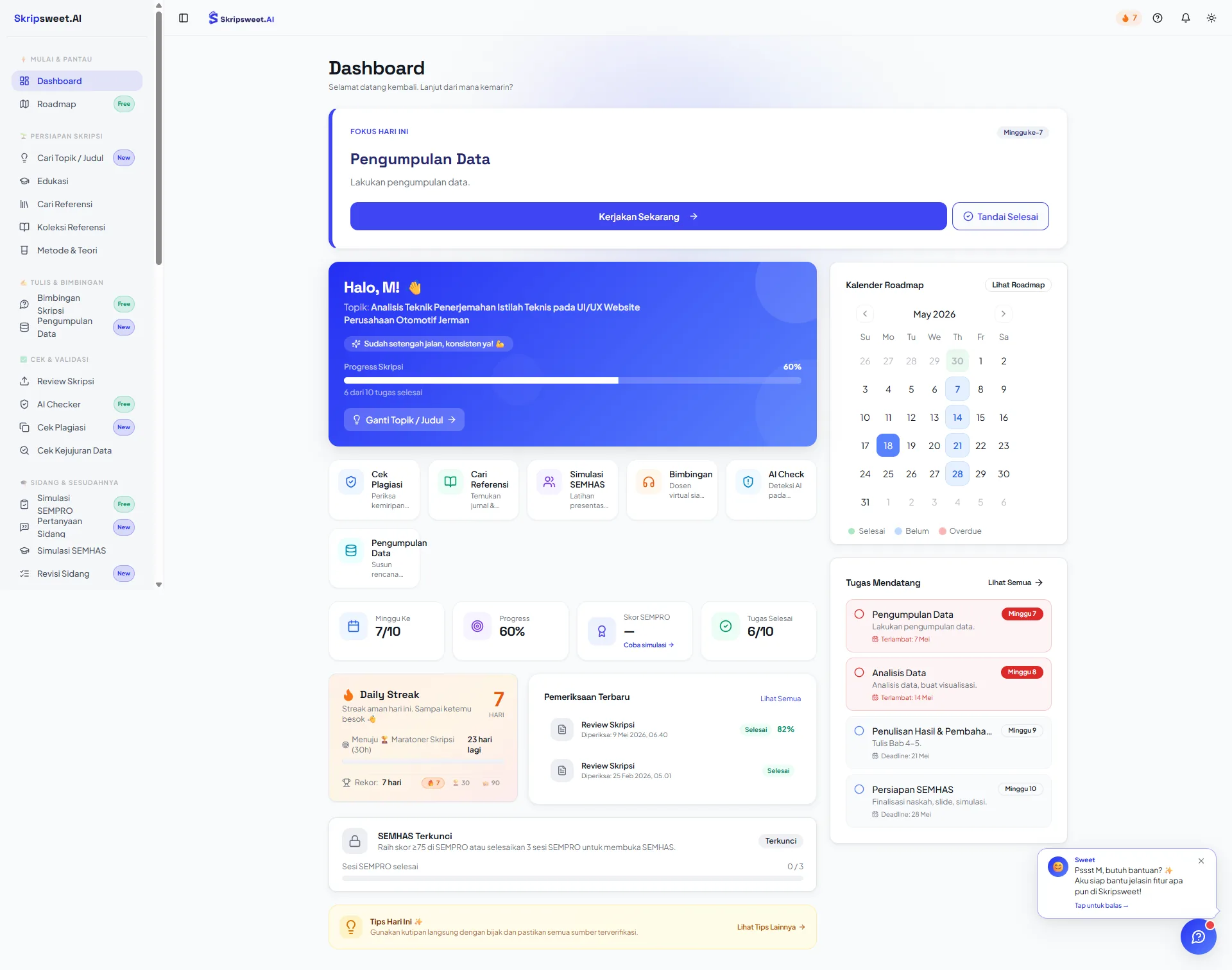
What I owned
- Research: desk research, in-depth interviews, a survey, and an analysis of the alternatives students already use.
- Information architecture: using the student’s thesis phase as the main navigation axis.
- Interaction design: onboarding, mentor chat, weekly roadmap, per-chapter outline builder, defense simulation, progress tracking.
- Design system: type scale, colour tokens, and components with variants, built so features ship without rebuilding the interface.
- Brand: name direction, mascot, colour system and voice.
- The marketing site and pricing page.
What can be checked
- Live, taking subscriptionsskripsweet.com resolves and serves the production product.
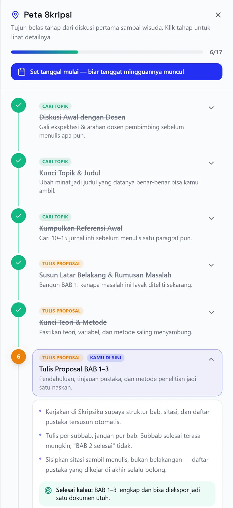
- Seven ordered stepsShipped product navigation; visible in the phase map screen.
- Three paid tiersProduct Designer CV; live pricing page.
- The two ideas with the largest market demandInternal design case study, ideation chapter.
Challenge
For many Indonesian students, a thesis is their longest academic project and the one with the least day-to-day support.
A final-year student picks a topic, submits it to a supervisor, then writes five chapters over six to twelve months. Two hearings decide whether they graduate: a proposal seminar covering chapters one to three, and a results seminar covering four and five.
In practice, supervision may happen only once every two to four weeks. One lecturer can be responsible for dozens of students. A session often lasts fifteen to thirty minutes, with much of that time spent revisiting the draft before there is room to discuss the next step.
Between those meetings, students are often left to work out the next decision alone.
- Falls shortCohort group chats and senior studentsGood for morale and for guessing an examiner’s habits. Nobody in the group knows more than anyone else, and panic spreads.
- Falls shortGeneric AI chatbotsExplain concepts and tidy sentences, but forget the research topic. Every conversation starts from zero, and they write for you rather than teach you.
- Falls shortWestern research toolsStrong at literature search and citation management. They do not know what a proposal seminar is, or a campus formatting guide, or Indonesian academic phrasing.
- Falls shortPaid ghostwritersIt promises certainty, which makes it appealing when a student feels stuck. It is expensive, carries academic consequences, and leaves the student unable to explain their own manuscript at the defense.
Ghostwriting sells because it promises certainty at the moment a student feels least certain. The other options provide information, then return the decision to someone who still feels unable to make it.
Skripsweet was designed for the space in between: enough guidance to make the next decision, while the student keeps ownership of the work.
How might we support a student each day, remember their topic and method, and still leave the academic work in their hands?
That question defined the central tension. Students may ask for a finished chapter when they feel stuck, but receiving one removes the understanding they will need later. A reading list on its own does not solve the uncertainty either.
We kept the question visible in every design session. Each feature had to answer one test: does it help the student make the decision, or does it make the decision for them?
Research & framing
The research used four tracks. Interviews helped explain why students struggled, while the survey showed how often the same problems appeared.
Desk research mapped how the thesis process runs across different campuses and captured the vocabulary students use. Each in-depth interview lasted forty-five minutes and involved a student currently working on a thesis, while the difficult moments were still recent. A survey checked how widely those problems were shared. We also reviewed the tools and services students already used to understand where Skripsweet could help.
Participants were screened for a mix of public and private universities, and a mix of quantitative and qualitative disciplines.
We did not ask participants directly whether they would pay. Instead, we asked what they had already spent money on for their thesis, including printing, binding, data processing, mobile data, and help from other people. Past behaviour gave us a more useful signal than a hypothetical answer.
We split the transcripts into individual quotes and grouped them without predetermined categories. One unexpected cluster kept appearing: students worried about being accused of using a ghostwriter, even when they were doing the work themselves. That anxiety changed the way the product speaks.
Students who feel stuck usually already have notes, downloaded journals, or a half-finished draft. What they lack is confidence in the next step. Too many possible directions, with no clear order, leave them unable to move.
Build the product as a sequence that remembers where the student is and points to the next step.
The peak of anxiety is not the blank page. It is sitting in front of examiners and being unable to answer. Several participants described a finished manuscript they were too afraid to schedule a hearing for.
Make defense simulation one of the product’s main tools, with a timer, a demanding examiner, and a score.
“What am I supposed to do now?” is a daily question. Students do not open a laptop once a week for a long session; they open it late at night, tired, with an hour left, and spend the first fifteen minutes remembering where they stopped.
The first screen answers that one question with one step. It does not present a menu.
Fear of being accused of cheating is as large as fear of not finishing. Even students writing entirely by themselves worry the manuscript will read as machine-written.
Turn the anti-ghostwriting principle into a clear product promise on the homepage, in the pricing, and in the shape of every AI response.
Needs change drastically by phase. A student without a title and a student waiting for a hearing are effectively using different products. Offering both the same features disappoints both.
Use the thesis phase as the product’s main organising principle. It determines navigation, the first screen, and even the pricing-tier names. The product asks for it during onboarding.
Generic help fails because it has no memory. Participants described re-explaining their topic, method and variables in every new conversation, until the cost of explaining exceeded the benefit.
Store the title, department, method, and history of weaknesses at the product level so every feature can use the same context.
Three personas came directly out of the phase finding: a student with no approved title yet, a student buried in post-seminar revisions, and a student three weeks from a defense. Each needs a different product.
We also wrote an anti-persona: a student looking for someone else to write the thesis. We chose not to serve that need, even though this group may be willing to pay more. Naming it early made later decisions easier. If a feature mainly helped that person, we removed it.
Structure, flows & trade-offs
The project changed when we stopped organising the product around features and started organising it around the student’s thesis journey.
Before prioritising anything, we tested each idea with the same question: does this guide the decision, or take it over? The filter removed two of the most tempting ideas, even though they would have been easy to sell.
- ChosenContext-aware chapter mentoringGuides. Answers questions knowing your topic, method and position.
- RejectedAutomatic chapter generatorTakes over. Enter a title, receive a finished chapter ready to paste.
- ChosenTimed defense simulationTrains. A virtual examiner asks one question at a time, then scores.
- RejectedBulk paraphrase rewriterFacilitates cheating. Paste someone else’s manuscript, receive a version that passes a plagiarism check.
- ChosenScored topic guideExplains criteria. Several research directions, each with the reason it is viable.
- ChosenExaminer revision trackerOrganises. Hearing notes become a task list with status.
Rejecting the two highest-demand ideas was a costly decision, but it gave the product a clear boundary. We scored the remaining ideas with RICE and scoped the MVP around one complete journey, from “no title yet” to passing the proposal seminar.
Two information architectures were considered.
- RejectedOption A — grouped by feature categoryWriting tools sit in one drawer and checking tools in another. It is tidy and easy to extend, but it asks the student to choose a tool before they understand what they need. It answers “what tools are available?”
- ChosenOption B — grouped by work phaseThree zones: an answer zone, a seven-step ordered work path, and account. Flat, sequential, no drawers. It answers “what am I supposed to do now?”
Both options contain the same features. The difference is the number of decisions required before work begins. Option A asks the student to choose a drawer and then a tool. Option B opens directly on the main path.
The user’s position in the thesis became the navigation axis. The product structure now follows the structure of the work.
Four principles kept it focused. Each zone uses one organising idea. The home screen gives one next step. The seven rows are numbered because a thesis has a real sequence. Supporting features remain available on their own pages, where students can find them when needed.
Because most traffic comes from phones, the hierarchy had to fit into five thumb-friendly slots: home, manuscript, mentoring, a primary Continue button, and the full menu. We set one rule during wireframing and kept it throughout the build: every icon has a one-line label that never truncates. Students should not have to guess what a navigation icon means.
Two flows carry most of the product: the first session and the daily return. The first session targets under three minutes and ends with something personal: a diagnosis of the student’s phase, their three largest risks, and a seven-day plan. The daily loop is simpler: open the product, see one step, do it, and mark it complete.
Solution
Every part of the product uses the same saved research context, so students do not have to explain their thesis again each time.
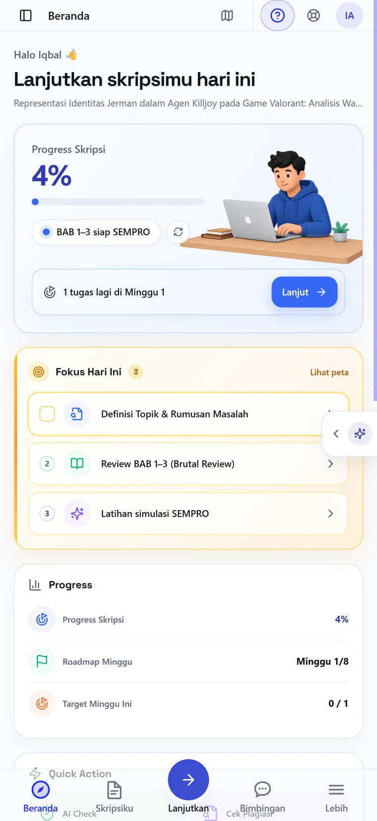
The home screen is Zone 1: one answer and one action. Progress, the week’s focus, and a single Continue control that remembers the last position rather than restarting the sequence.
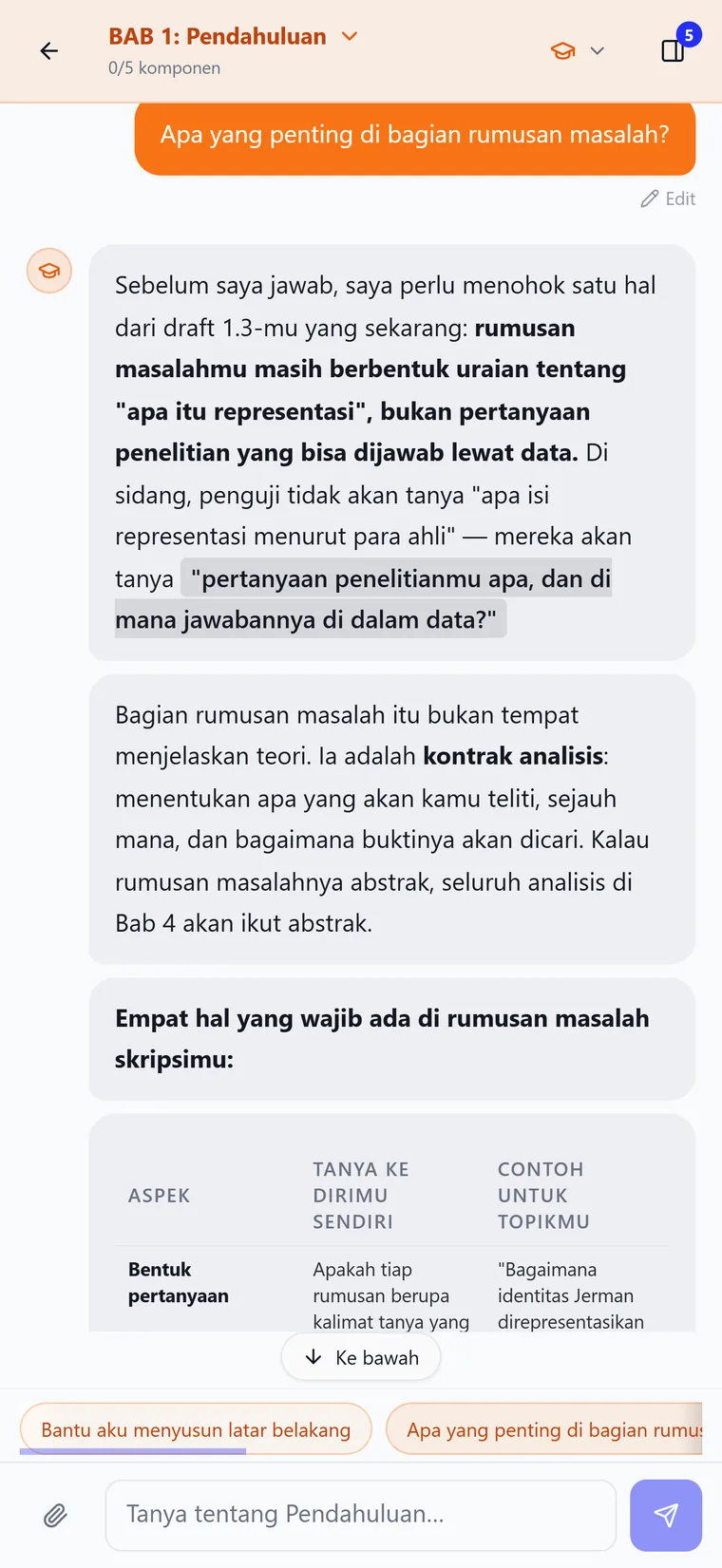
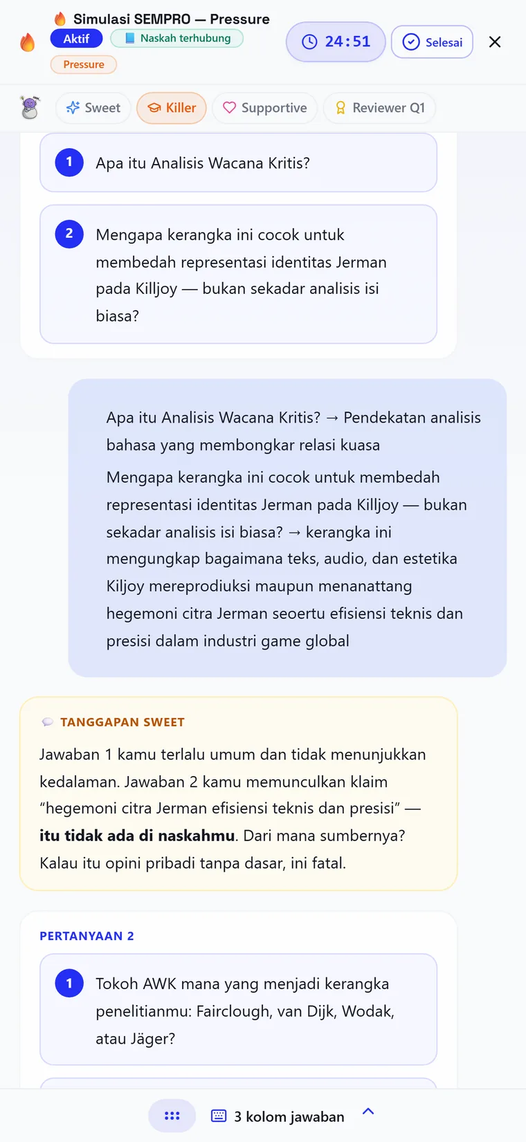
The mentor responds with structure. When asked about a research question, it explains what the question needs, points out a mismatch between the method in chapter three and the framing in chapter one, then asks the student to revise it. This is how the anti-ghostwriting principle appears in the interaction itself.
The defense simulation runs a countdown, offers examiner temperaments from supportive to hostile, asks one question at a time, and scores the answers. When an answer contains a claim the manuscript does not support, it says so directly.
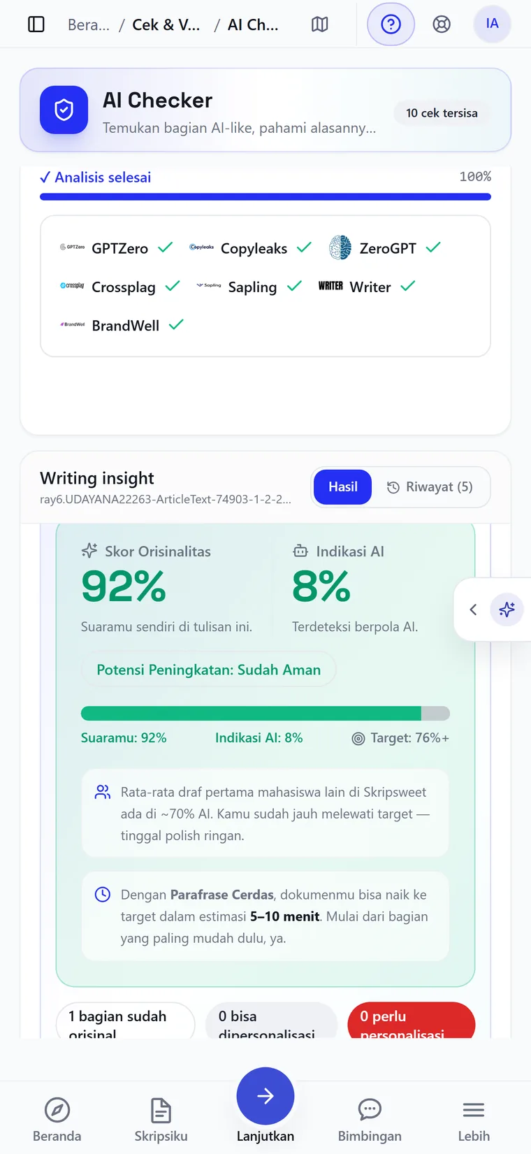
The AI-detection screen grew from the research insight about false accusations. It reports across several detectors, then explains in plain language what the number means and what the student can do next. A bare percentage would only add to the anxiety.
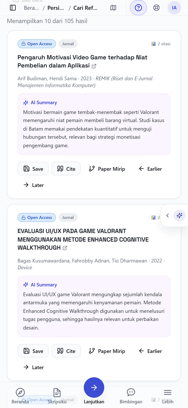
Reference search returns open-access work with a short relevance summary on each result, so scanning a list does not mean opening twenty tabs.
Colour. Indigo balances an academic blue with a warmer violet, helping the product feel serious without resembling a banking app. Semantic colours stay separate from the accent so their meaning remains clear.
Red appears only when something genuinely needs attention. Thesis students often associate it with a supervisor’s corrections, so using it for minor messages would make the interface feel unnecessarily tense.
Type. A geometric display face, used sparingly for page titles and large numbers, gives the product a firm voice without becoming formal. The body face is an Indonesian-designed family optimised for the language, so long words stay comfortable on a phone. A monospace family handles numbers, chapter numbering and countdowns, so changing digits do not shift the layout.
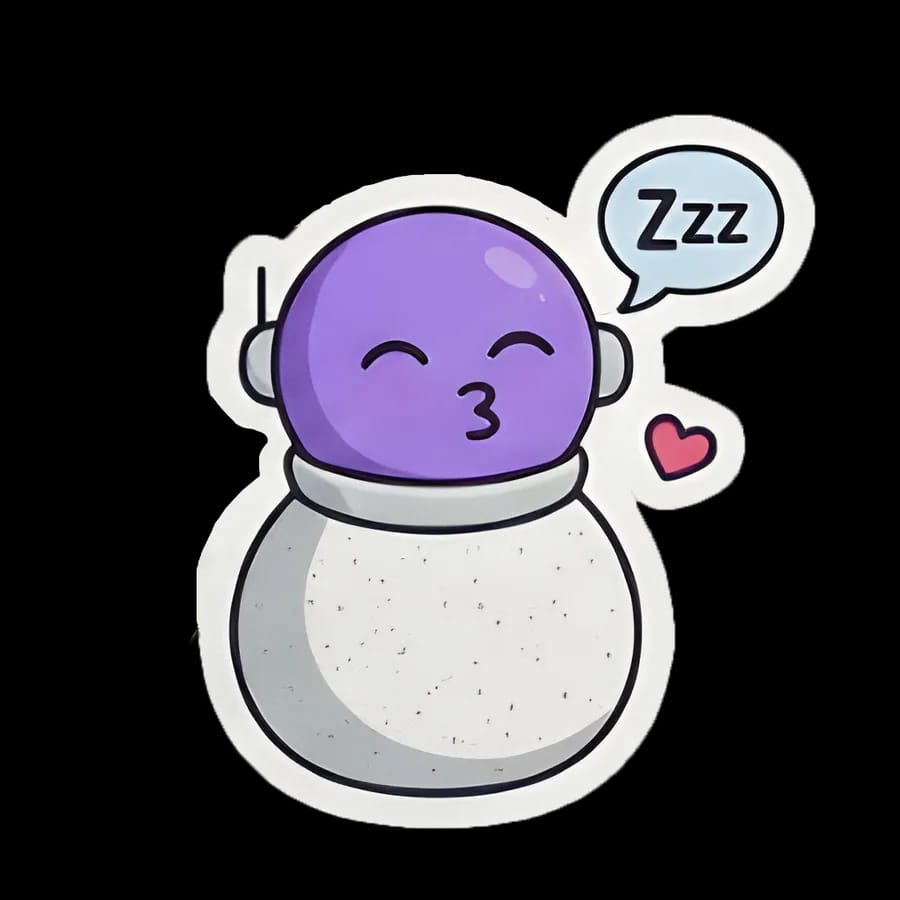
Sweet gives the AI mentor a consistent face. The character helps the guidance feel like ongoing support and reinforces that the product is a companion in the process.
The voice follows four rules. Address the reader directly. Use clear, relaxed language such as “the method in chapter three does not connect to the problem statement in chapter one”. Be honest about limits by saying what has been used, when it resets, and what a subscription includes. Avoid lecturing.
The final rule came directly from interviews. Thesis students already hear that they are behind from supervisors, parents, and classmates who graduated earlier. Another judging voice would give them one more reason to close the product.
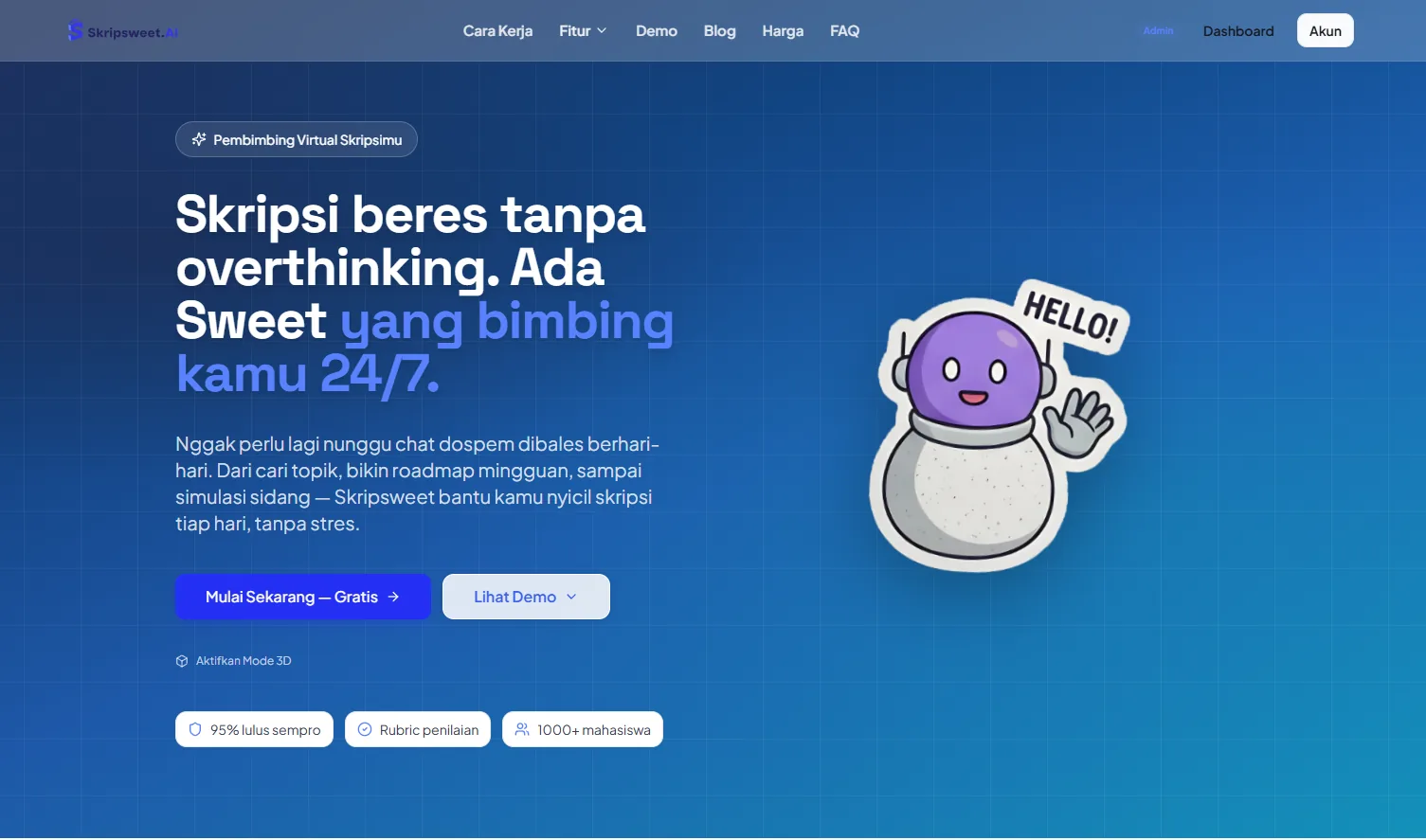
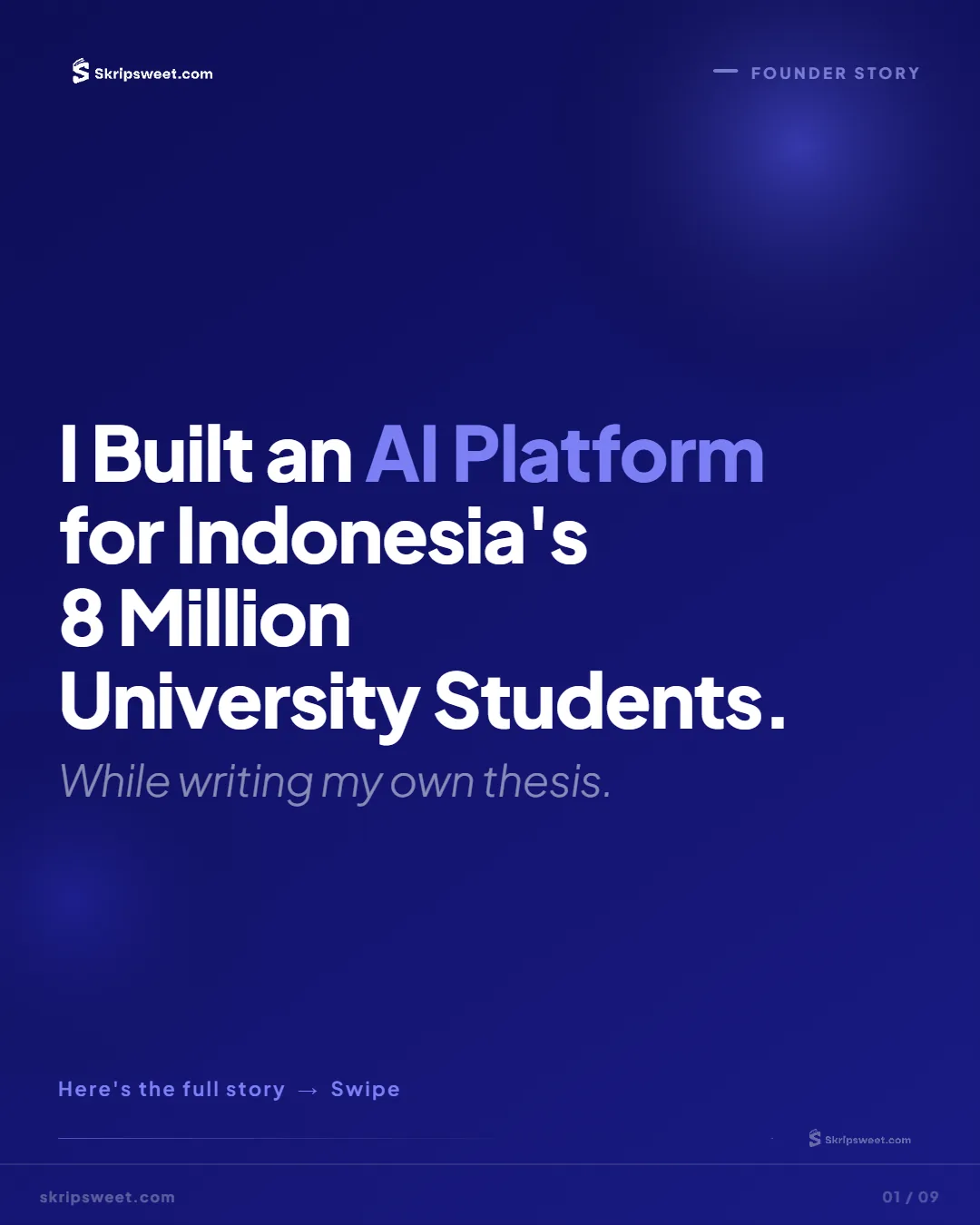
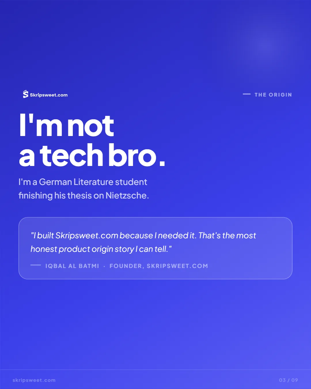
The same visual and verbal system carries the marketing site, pricing page, and campaign work. A student may move from an ad to the landing page and into the app within a few minutes, so those surfaces need to feel connected.
Validation & iteration
Each remotely moderated round involved five participants. We repeated the process across three rounds so the team could find serious problems and still test again in the next sprint.
Every round included all three personas because each thesis phase creates a different experience. The device mix matched real usage, with four phones for every laptop. Round one tested wireframes, round two used a prototype, and round three used the beta build. We measured task success, completion time, single-ease scores, and moderator prompts.
Tasks were written as situations people might recognise: you just heard about this from a friend; get started until you know your first step; you have supervision tomorrow; prepare something to show; your hearing is in three weeks; get ready; you have hit a quota limit; decide what to do.
- 01
Structuring
Round one asked whether participants could understand phase-based navigation without an explanation. They could, but three suggested-step buttons at the top of the screen made the starting point less clear.
- Three step buttons became one Continue
- The label “Dashboard” became “Now”
- The seven-step workflow was locked as the navigation backbone
Three useful options still create a decision. For someone who came because they feel unsure, fewer choices can be more helpful.
- 02
Moving the value moment
Once the visuals were in place, onboarding started to feel like a registration form. Participants answered three questions, then arrived on an empty dashboard at the moment they expected something personal.
- The diagnosis report was inserted before the dashboard
- Onboarding can accept an existing draft upload
- Every navigation icon was given a permanent label
Screen order shapes the experience. Moving one screen, without changing its content, changed the first impression of the whole product.
- 03
Meeting real usage
The beta showed what a forty-minute session could not. After a few days away, users returned and struggled to remember where they had stopped. When they reached a quota limit, some thought the product was broken and left.
- The Continue zone remembers the last position instead of restarting
- Limit messages name three things: what was used, when it resets, what a subscription opens
- Occasionally-used features moved off the main path
- Progress and streak were made visible
The wording of an error changes what people do next. Treating “this feature is not enabled” and “you are out of quota” as the same event made users think the product was broken.
- 04
Simplifying what had already grown
After release, new features gradually made the navigation harder to follow. One panel ended up mixing three different organising ideas. This round returned the product to the simpler structure from round one and showed that a design principle needs regular maintenance.
- The sidebar returned to one paradigm per zone
- The seven steps were restored; everything else moved to separate pages
- Mentoring follows progress instead of restarting from the beginning
- Overstated claims were pulled off the homepage
The most helpful change in the project added no new capability. It simply reduced how much the user had to look at.
Outcome
The live product still follows the structure designed in chapter three: seven ordered steps on the main path, supporting tools on their own pages, and the thesis phase deciding what each student sees first.
- Seven ordered steps, topic through post-hearing revisionShipped product navigation.
- Seven, each deciding the first screenOnboarding step three; shipped phase map.
- Under three minutes to a personal resultDesign target recorded in the internal case study.
- The two ideas with the largest market demandInternal design case study, ideation chapter.
Pricing follows the same logic. Tiers are named after thesis phases, helping students choose based on where they are in the process.
What is not shown here. Adoption and commercial figures appear in my CV, but I have not published them on this page because I do not have an export attached for readers to verify. The usability figures, including task success, single-ease scores, and completion times, remain unpublished for the same reason.
Reflection & limits
An early constraint sped up later decisions. The anti-ghostwriting principle initially felt restrictive. In practice, it gave the team a quick way to settle feature debates.
The navigation model shaped every screen. Following the structure of thesis work gave the product a clearer foundation than grouping everything by feature type.
A user’s question can make a better label. Renaming “Dashboard” to “Now” came from one sentence in a test session. The new label tells students what the page will help them answer.
What I would do differently.
Instrument the main journey from day one. For months, the product could only see user count and buyer count. Those figures showed that something was happening but gave the team little guidance on what to improve. Adding per-step funnel tracking later took half a person-week and should have happened before release.
Test the structure before building anything. The wireframe round caught the three-button problem in forty minutes. A comparable problem that reached production took weeks to notice, and a full round of repair to straighten out.
What should be redesigned next. The supporting-feature pages remain the weakest part of the system. Moving them away from the main path kept that path focused, but those pages still need a clearer structure of their own. The product also needs a gentler return experience for a student who has been away for three weeks. That moment is emotional, while the current response is mostly functional.
Thesis students need help that understands where they are, points to one useful next step, and then leaves the work in their hands.