UX Learning
A twelve-month UI/UX curriculum with an interactive playground, a skill radar and a portfolio track, running entirely on the learner’s own device with no account.
Challenge
UI/UX resources are everywhere. What most beginners lack is a clear order for learning them.
Self-taught designers rarely stall for lack of tutorials. They stall because everything is available at once — colour theory beside design systems beside accessibility beside portfolio advice — with nothing saying which comes first, or whether the last thing was learnt well enough to move on.
The result is lopsided: strong visual work with no research practice, or the reverse. And it stays invisible until a portfolio review points it out, which is late.
UX Learning is built for the learner working alone, with a stated ambition to reach an international standard: start from small skills, build toward a standard, and be able to see where you actually stand along the way.
- Falls shortFree tutorialsThere are plenty of them, but they rarely agree on what a beginner should learn first.
- Falls shortA paid bootcampProvides the order and the deadline, at a price and a schedule that rules out most of the people who need it.
- Falls shortFollowing a public roadmapTells you the topics and nothing about whether you have learnt them, which is the question that actually blocks progress.
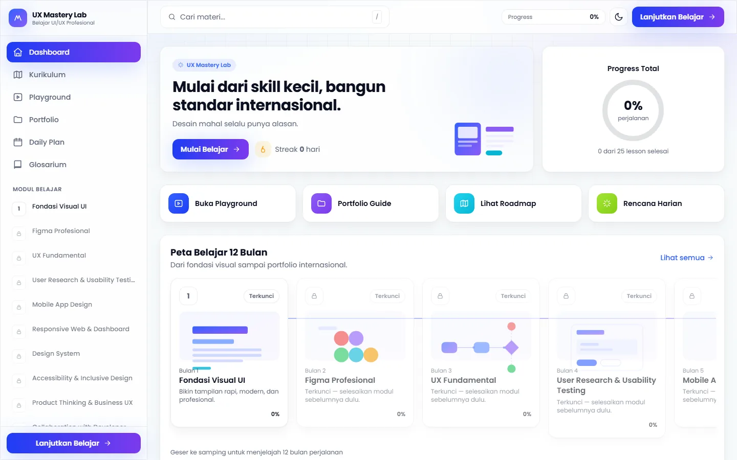
Mulai dari skill kecil, bangun standar internasional.
Research & framing
Structure, flows & trade-offs
Twelve modules in order, with a clear view of current strengths.
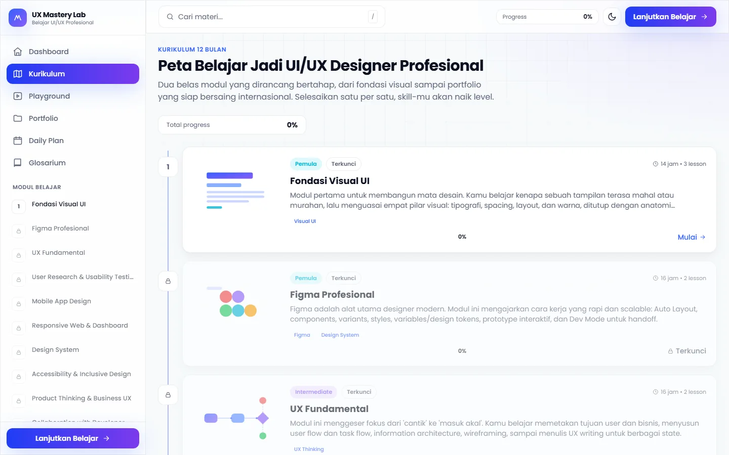
The curriculum is a twelve-month map, and the sequence is the argument: visual UI foundations, professional Figma, UX fundamentals, user research and usability testing, mobile app design, responsive web and dashboards, design systems, accessibility and inclusive design, product thinking and business UX, collaboration with developers, AI product design, and finally the international portfolio.
Modules stay locked until the ones before them are finished. That constraint exists precisely because skipping ahead is what produces the lopsided skill set above.
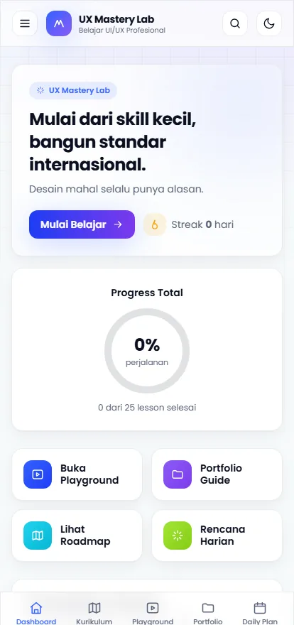
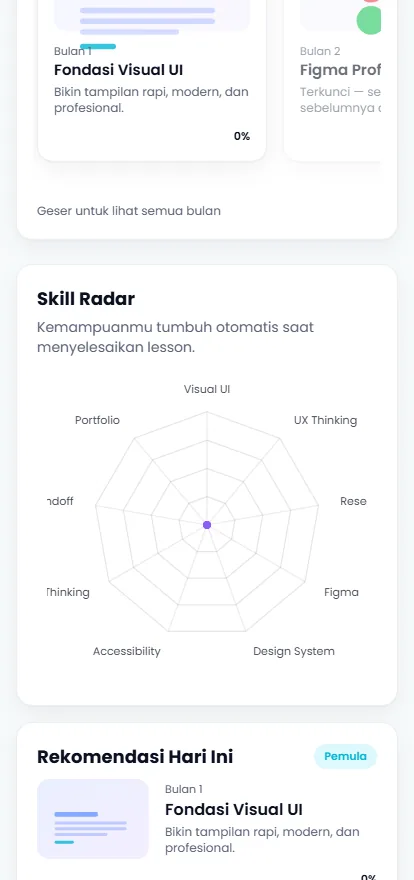
Around the map the app splits into dashboard, curriculum, playground, portfolio, daily plan and glossary. The dashboard is the working surface: a skill radar across visual design, research and Figma, a progress ring, and a short list of what to practise today.
- ChosenModules locked until the previous one is doneSkipping ahead is exactly what produces the lopsided skill set the product exists to prevent.
- ChosenA skill radar rather than a single scoreAn uneven shape makes the gaps visible. One percentage would hide the difference between disciplines.
- ChosenNo account; progress stays on the deviceThe curriculum opens and works immediately, with nothing to sign up for. The trade-off is that progress stays on that device.
The app is six routes, and the split is the argument. The dashboard answers what to do now; the curriculum shows the whole twelve-month path with per-module progress; the playground is where a technique is tried; the portfolio section is where it is written up; the daily plan turns all of it into today; and a glossary catches the vocabulary problem that stops beginners reading anything else.
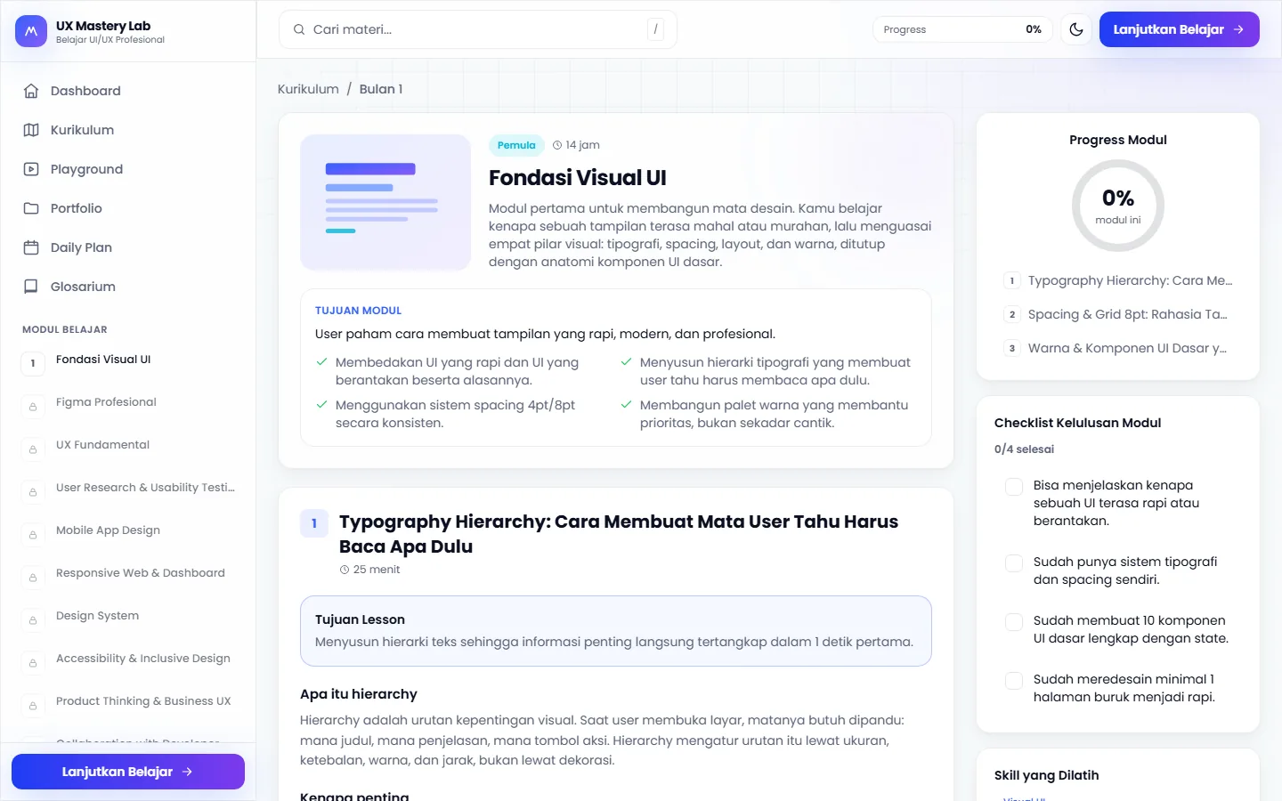
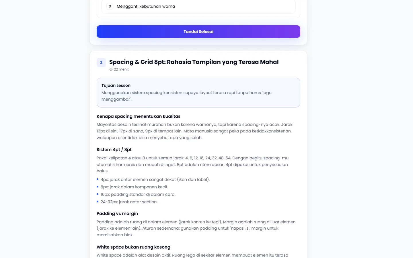
A lesson is its own page rather than a modal — objectives on one side, a progress ring and a completion checklist on the other. Marking a module finished is a deliberate act, which is what makes the gating on the next one mean something.
Solution
The dashboard answers "what now", the radar answers "where am I", the playground answers "where do I try this".
A twelve-month map that is always visible. The whole path shows as module cards with their state, so progress is legible from the first screen instead of buried in a menu.
A skill radar rather than a score. Strengths are plotted across disciplines, because a lopsided shape is the signal — and a single percentage would hide exactly that.
Daily recommendations. Each day surfaces a small set of timed practice tasks, which keeps the unit of work at something that fits inside a real evening.
An interactive playground. Practice happens inside the app rather than as a link out to somewhere else.
No account. Progress stays on the learner’s own device, so the curriculum can be opened and used immediately with nothing to sign up for and nothing to lose track of.
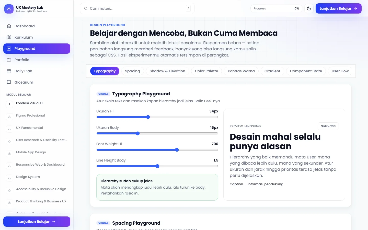
The playgrounds are the part that could not be a PDF. The typography playground puts heading size, body size, weight and line height on live sliders, re-renders the specimen as you move them, and prints the resulting CSS underneath — so the lesson is not "hierarchy matters" but the sight of hierarchy appearing and the code that produced it.
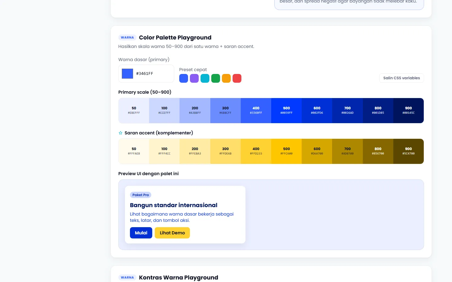
The colour playground does the same for a palette: pick a base and it generates the full 50-to-900 ramp plus a complementary accent, previewed on a real card. Both take the same position — that a design principle is learnt by moving it, not by reading about it.
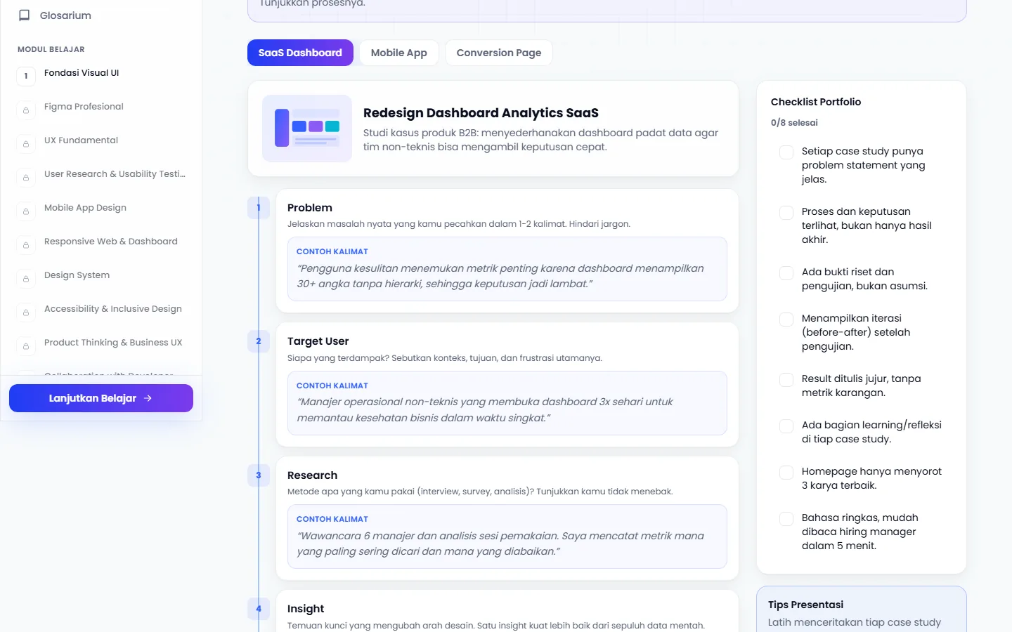
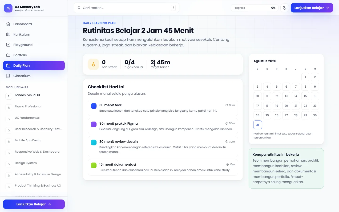
The last stretch is the one most self-teaching skips. A portfolio case-study template prompts for problem, target user, research and insight in order, with a checklist of what a portfolio piece actually needs beside it. And the daily plan sets out the time commitment clearly: about two and three quarter hours, broken into timed tasks. Learners can see what the routine asks from them each day.
Validation & iteration
- 01
- 02
- 03
Outcome
- Live at uxlearning.netlify.appchecked 1 September 2026
- Dashboard, curriculum, playground, portfolio, daily plan, glossary and lesson pages, all without an accountchecked 1 September 2026
- Desktop and phone layouts both shippedboth captured for this case study
The whole curriculum is public and working: twelve months of modules, lesson pages with objectives and checklists, two interactive playgrounds that render live and print their own CSS, a portfolio case-study template, and a daily plan. Every screen in this case study can be opened by a reader without signing in.
Reflection & limits
Progress living on the device is the decision that makes the product frictionless and also the one that quietly undermines a twelve-month commitment: clear the browser, change laptop, or open it on the phone that the mobile layout was carefully built for, and the twelve-month map resets to zero.
Nowhere in the interface is that consequence stated. An export would be a small feature and a large honesty improvement.