Vanguard Construction
A B2B site for a commercial and civil construction contractor, using an engineering-drawing visual language for procurement teams who read specifications before they read marketing.
Challenge
The audience reads drawings for a living. Marketing language is the wrong register.
A commercial contractor’s website is read by developers, public authorities and procurement teams. They are assessing capability, scope and delivery risk, and they are fluent in exactly the documents a construction company produces — drawing sets, specifications, phase markers, project registers.
Written the usual way, a site works against them: photographs of hard hats, adjectives about quality, and no way to answer the questions that decide a shortlist. Which disciplines are held in-house? What has actually been delivered, and at what scale? Does the finished structure match what was issued for construction?
The design problem here is register. The site has to sound like the specification, because the specification is the document its readers trust.
- Falls shortThe standard contractor websitePhotographs of hard hats and adjectives about quality. It answers none of the questions that decide a shortlist.
- Falls shortA downloadable capability PDF aloneRight register, wrong place. It is read after someone has already decided you are worth a download.
- Falls shortA gallery of finished buildingsShows the outcome but leaves out the delivery details: scope, sequencing and whether the built thing matches what was issued.
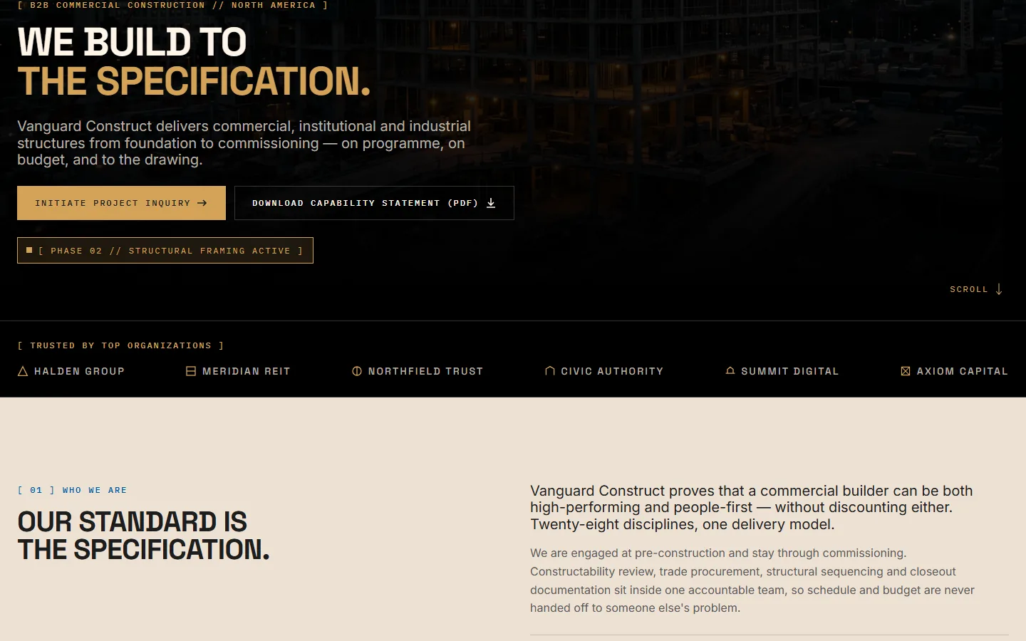
OUR STANDARD IS THE SPECIFICATION.
Research & framing
Structure, flows & trade-offs
Capability, evidence, and numbers in the order a bid gets assessed.
The page is sequenced the way a procurement reader works: who the company is, what it can do, what it has built, how it performs, and only then careers and contact.
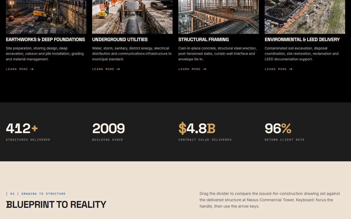
Capability is stated as four integrated disciplines under a single contract — earthworks and deep foundations, underground utilities, structural framing, and environmental and LEED delivery — with the argument attached: no scope gaps, and no coordination cost passed back to the owner. Each discipline lists its real scope rather than a slogan.
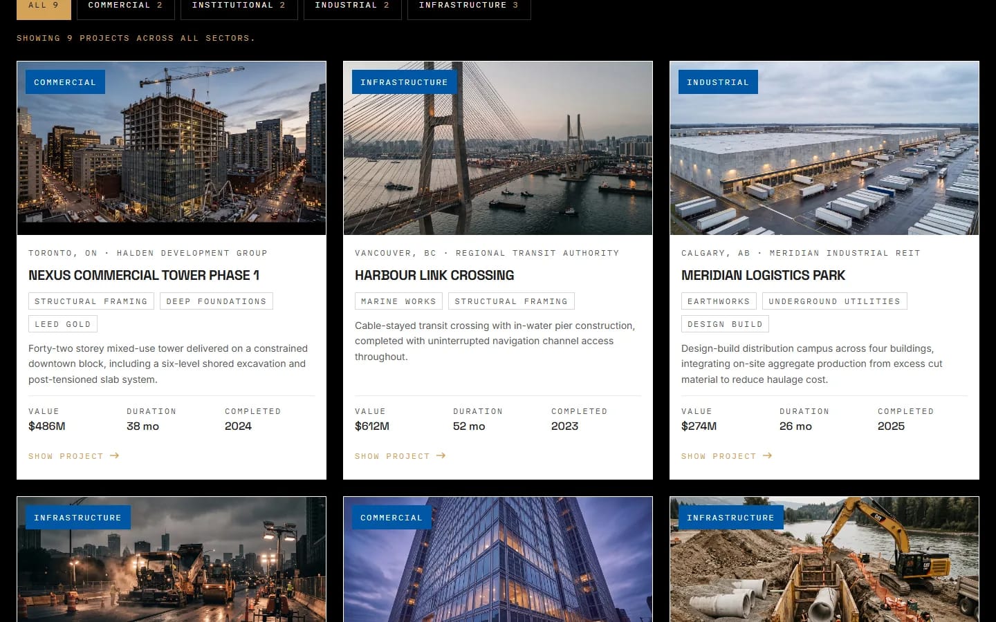
Evidence is the project register: nine representative structures shown out of a stated 412, filterable by sector, each with its location and client. Showing nine and naming the total is a more credible move than showing nine and implying they are everything.
- ChosenEngineering-drawing register as the interface languageBracketed section markers and phase labels. The audience reads title blocks for a living, so familiar project language helps them scan the page.
- ChosenNine projects shown, 412 statedNaming the total is more credible than showing nine and implying they are everything.
- ChosenA drawing-versus-delivered comparison, keyboard operableThe strongest thing a contractor can show, built so it also works for a reader who never leaves the keyboard.
The register is filterable by sector and also paginated as a table, with contract reference, sector, value and completion status in columns. Two views of the same data, aimed at two ways of reading: a card grid for someone browsing for relevant work, a table for someone checking whether a specific reference is real.
Solution
Engineering-drawing conventions used as an interface language, not as decoration.

Bracketed labels and phase markers. Navigation and section headers are set as annotation — [ NAVIGATION ], [ B2B COMMERCIAL CONSTRUCTION // NORTH AMERICA ], [ PHASE 02 // STRUCTURAL FRAMING ACTIVE ] — borrowing the register of a title block rather than of a brochure.
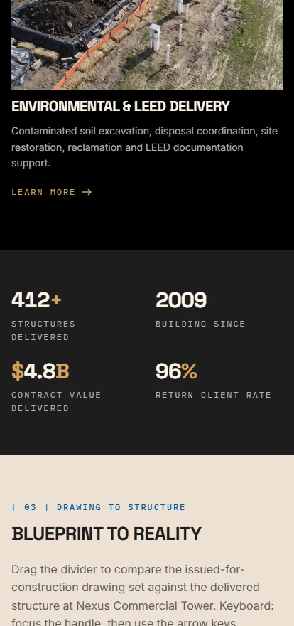
The blueprint-to-reality comparison. A draggable divider reads the issued-for-construction drawing set against the delivered structure at Nexus Commercial Tower. It is the single strongest thing a contractor can show, and it is operable by keyboard as well as pointer: focus the handle, then move it with the arrow keys — which matters for readers who work from a desk all day.
A filterable project register. Commercial towers, a harbour crossing, a logistics park, a civic corridor, a teaching hospital, a campus masterplan — filterable by sector, with the visible count stated as you filter.
Scope written as scope. Shoring design, caisson and pile installation, post-tensioned slabs, curtain wall interface, contaminated soil disposal coordination. The vocabulary of the work itself is both more useful and more convincing to this reader than a summary of it.
The head office address in the navigation, because for a B2B contractor a physical address is a credential.
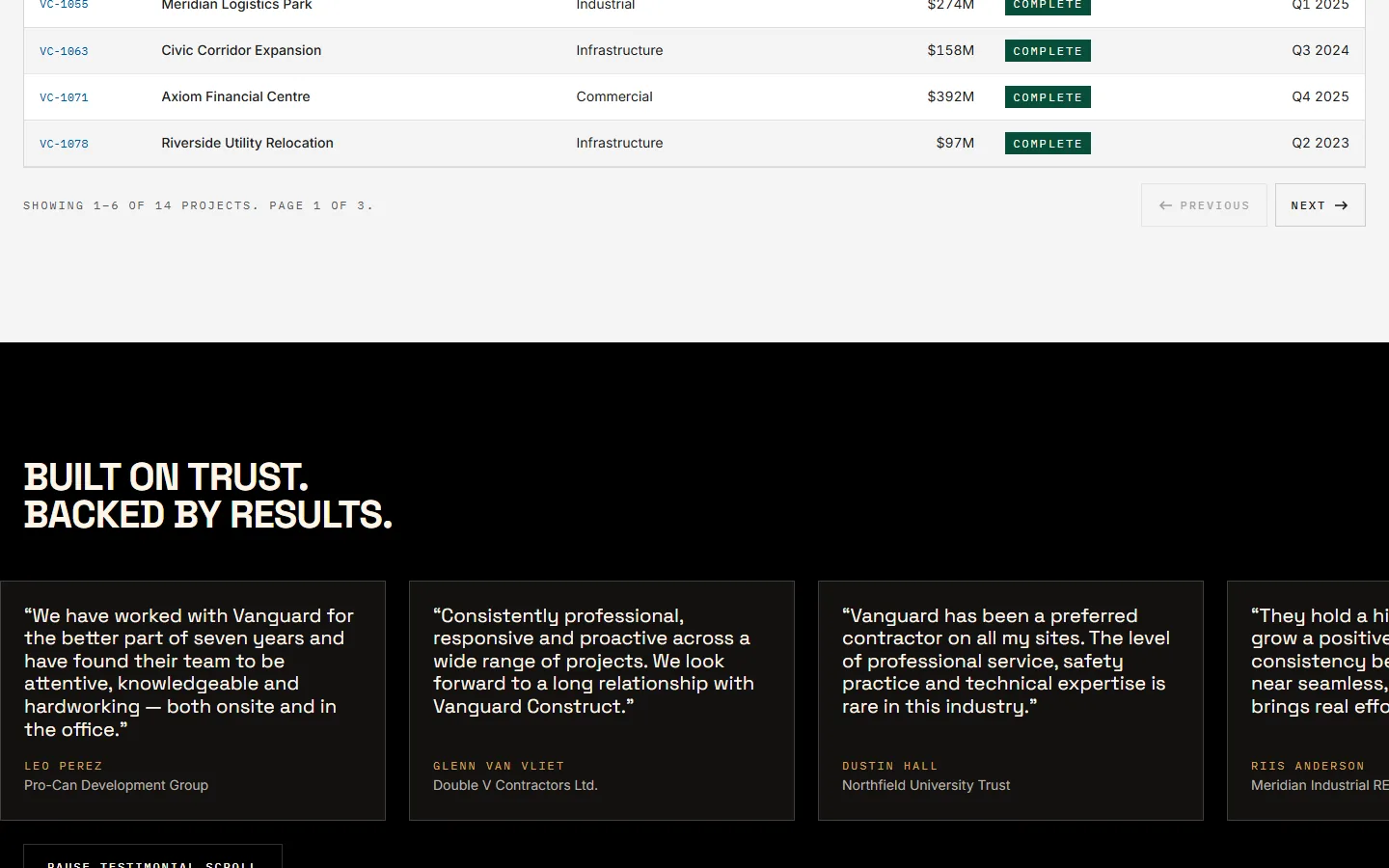
Testimonials are attributed to a named person at a named organisation — a pre-construction group, a contractor, a university trust — which is the difference between a quotation and a reference. In a sector where a shortlist is assembled by phoning previous clients, an unattributed quote is worth nothing.
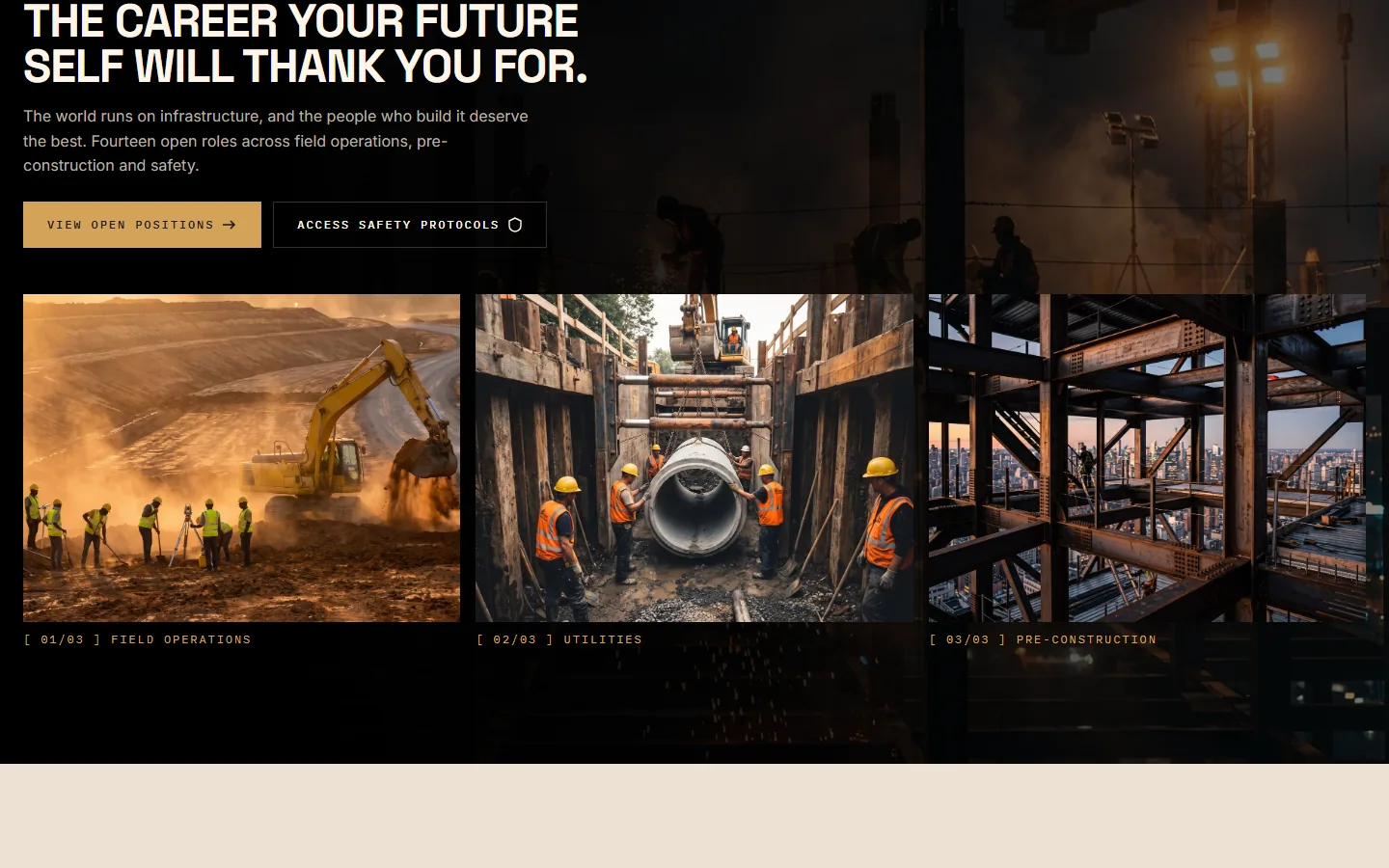
The careers section is given the same register as the rest: open positions and safety protocols as two equal actions, over photographs of field operations, utilities and pre-construction. Putting safety beside recruitment is a position, and on a contractor’s site it is read as one.

The final action is a tender inquiry, not a contact form. It asks for the band, scope narrative, programme dates, and procurement route. It states a minimum length and says where attachments go, matching the document a procurement team is already writing. Asking for what the work actually needs, in the words that work uses, is the whole argument of the site compressed into one form.
Validation & iteration
- 01
- 02
- 03
Outcome
- Live at vanguardconstructionn.vercel.appchecked 1 September 2026
- Capabilities, project register with sector filter, blueprint comparison, testimonials, careers and a tender inquiry formchecked 1 September 2026
- Desktop and phone layouts both shippedboth captured for this case study
What shipped is a procurement-shaped site: capability stated as scope, evidence stated as a register, the drawing-to-delivery comparison as the centrepiece, and a closing form that asks for a tender package rather than a name and an email.
Reflection & limits
The comparison slider is the best idea on the site and appears exactly once, on one tower. Its persuasive power comes from being repeatable — drawing against delivery, on project after project — and the register underneath it is full of candidates that get only a photograph.
The register itself is the other unfinished thought: nine cards and a paginated table, in a system that says it holds 412.